A few months ago, Birmingham, Alabama’s bus system (BJCTA Max Transit) retrofitted all of their buses with a GPS system. Along with this upgrade, they released a website allowing riders and the public to track the locations of buses in real time. The website is backed with a public RESTful API, so I decided I would poll the API to retrieve live information on all the buses throughout the day and store them in a local database.
With this information, it is possible to run some analysis on the system. We could look at passenger count, travel time, travel deviation, areas where buses tend to slow down, performance at different times of the day, and a host of other analytics.
The first analysis I have done is looking at the time deviation. This is how far ahead or behind schedule a bus currently is. A negative number means it is ahead of schedule and a positive number means it is behind schedule. The general rule is that ± 5 minutes is “on time”.
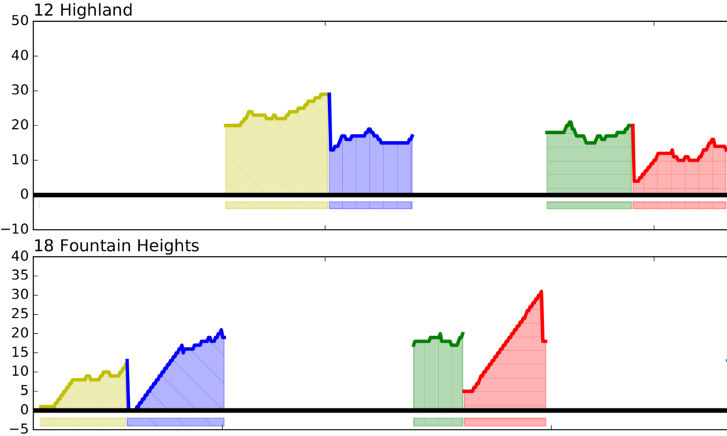
The graph below goes through an entire day looking at all the buses on each route. Each route is separated into its own section, so you can clearly see how a single route performs throughout the day. Along a route, multiple buses will simultaneously be making individual trips along that route. Each color represents a different bus making a different trip. Since there is overlap between buses sometimes making it difficult to see where a trip starts and ends, I have placed bars below the graph. Each of these bars mirrors a single bus making a single trip, allowing you to easily see how many active buses there are and when they started and stopped their trip.
If we zoom into a specific route, we can get more detail (Click on the image to see the full day). This is line 17 – Eastwood Mall. It is one of the busier routes with several buses making simultaneous trips. As you can see, most trips start and end on time, however, there is a bit of a peak about halfway through the trips, where the bus is behind schedule by up to 15 minutes.
After looking through the data, I have few interesting conclusions:
- There is quite a bit of deviation along most routes. However, the most important thing to look at is the start and end of each trip, and for most trips, those have a tendency to converge on 0 deviation. This means the overall trip length is as expected, but buses are being held up in the middle of trips due to traffic and other unforeseeable circumstances.
- I don’t know what happened to the 14 (Idlewild Palisades) around 5pm. I’m thinking the bus broke down and a new bus (purple) had to be sent out to replace it.
- Some routes are interlined. For example, the 12 and 18. The bus starts off as the 12, does its trip, but once it pulls into central station, that same bus becomes the 18 and does a trip along route 18. When it returns to central station, it once again becomes the 12. It appears as though the 18 is constantly taking longer than the expected time which makes the 12 start late. Even though the 12 makes up time, it can’t seem to ever get on schedule.
- The 280 runs down a major suburban corridor that has the worst traffic in the region. Even during rush hour at 5.00pm, the route is expected to have the same trip time as 10am. Clearly it doesn’t.
- The most heavily used routes: 17, 1, 3, 44, 45, 6, 28, 8, 1 Ex all have minor deviation and run on time.
The code is currently available on github:
I’m still cleaning up the code, but it is currently usable. I’m also thinking about porting this to D3 and doing live visualization on a website rather than generating a static image.


